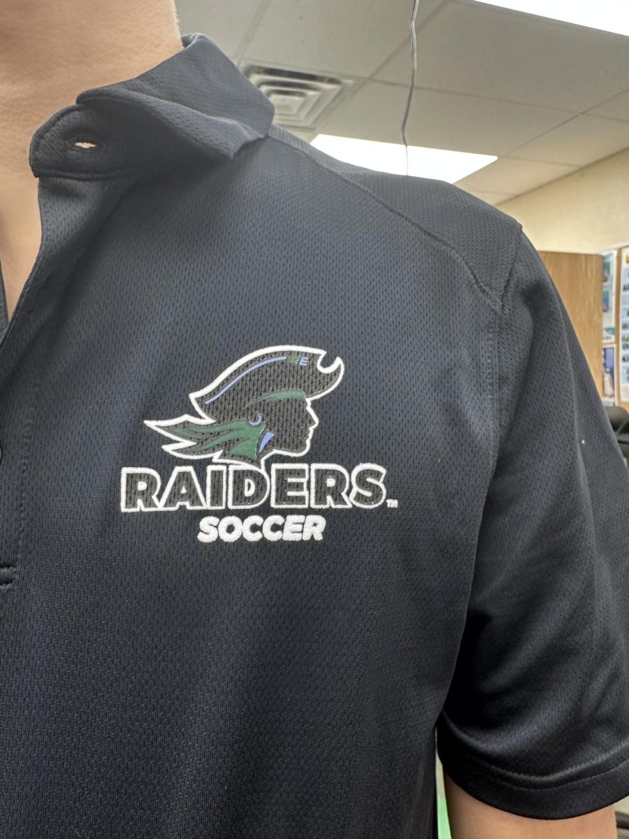
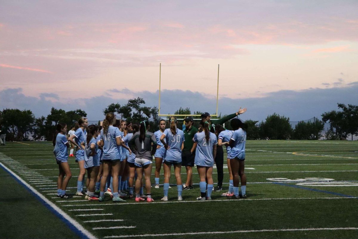
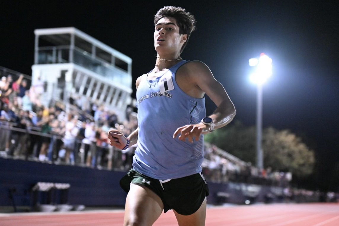
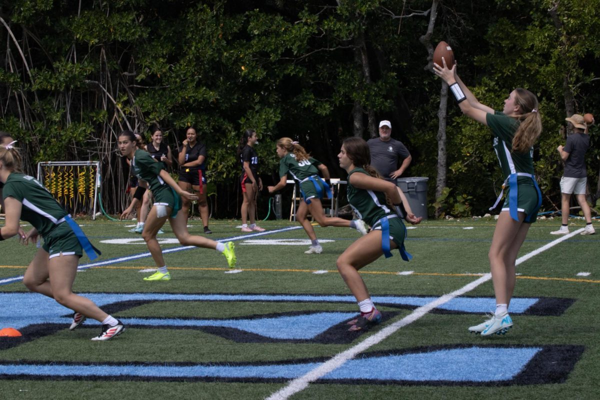
If you’ve been on campus, you’ve seen the new Raider. RE’s new logo, a silhouette of a pirate with a single earring and “RE” written on the hat, is everywhere: on the new basketball court on the glass doors of the Harry Anderson Gym, on new athletics shirts for virtually every team, and even on the vending machine.
The new logo is sleek, modern and seemingly simple, but the process of designing the logo was anything but straightforward. The new Raider had many tasks to accomplish, and there were many different iterations of our future logo attempting to address these needs. Some were slight tweaks on the old Raider; others were wilder and more unexpected, including a version of the Raider as a parrot.
Before the new Raider, much of RE’s athletic gear featured the same approach to branding: the standard “RE” in blue and green typeface. Frank Irias, the Creative Director at website and branding design firm Daisho Creative Strategies, and the designer of the new Raider, thought the typeface logo worked great as an academic symbol, but it left a quite bit to be desired athletically.
It’s very scholarly, but it’s unintimidating, Mr. Irias explained. “The (typeface) logo was made for an academic institution; athletics were an afterthought.”
Upper School Athletic Director Mr. Scott Berman agreed: Not only did the classic typeface green R and blue E not fully function as a proper athletic logo, but it had also been used for ages. “Things had gotten stale,” Mr. Berman said.
School leadership felt it was time to create a new sports logo. “We wanted a new modern look for the logo,” said Mr. Berman. So they contacted Daisho Creative Strategies, a local Miami branding company who designed the Westminster Warrior, the Florida Christian Patriot, and several other school logos.
For Irias, designing the new logo was no easy undertaking. “There were a lot of things we had to consider. We had to create a logo that would be modern but also had to avoid following trends, which would make it feel dated down the road,” he explained.
The new logo also had to be inclusive. Irias pointed out the androgenous features of the new Raider, such as the mascot’s long hair and face structure. “We decided a silhouette worked best,” he said. “Anyone could be a Raider; it’s not a boy or girl, or any race.”
As with any logo at Daisho Creative, designing the logo involved a back-and-forth process between the designers and the leadership team at RE. But RE’s process was also unique in some ways. “I’ve never seen a school get a roster of logos and run a poll with the student body,” Irias pointed out.
In the spring, RE unveiled a poll that would decide the new Raider’s look between two options: the dark silhouette (which eventually won), and a less ambiguous version of the Raider that looked similar to previous illustrations. Many designs were cut on the way to arriving at the final two, including a young raider, an even younger (de-goateed) raider, a pirate hat, and the parrot.
The poll was open to students and alumni, and on May 17, Chief Operating Officer and Interim Head of the Upper School Mr. David Clark ’86 formally announced that the silhouette had won. “More than 1,500 students and alumni took the time to cast a vote, and we are grateful to all of you,” Mr. Clark wrote. “We are pleased (and also a bit relieved) that students and alumni both preferred – by a significant margin – the same Raider.”
The implementation of the new logo happened quickly. Students were surprised by its sudden presence on the new outdoor basketball court, backpacks, T-shirts, and more, but also excited.
“It was surprising walking onto campus the first day, but I voted for that logo, and I like how it looks now that it’s actually real,” Andrea Paniagua ’24 said.


